Most businesses create multiple landing pages for their campaigns as they work better with conversion when compared to homepages.
Reports suggest that brands only have around 7 seconds to make a lasting impression on their audience.
Wow!
This means that for your landing pages to convert, they must attract viewers quickly.
If you’re looking for some inspiration to create or enhance your brand’s landing pages, you’ve come to the right place.
We’ve compiled 21+ awesome landing page examples just for you. That’s not all. We’ll also share some tips so you can optimize your landing pages.
But, before that. Let’s look at the definition and benefits of a landing page.
What is a Landing Page?
Landing pages are web pages where you have the opportunity to collect the viewer’s contact information in exchange for a resource (like freebies or newsletters).
Landing pages aim to convert a visitor into a paying customer through the use of a CTA. The idea is to collect the visitor’s information and nurture the lead through targeted marketing.
Landing pages can benefit businesses by
- Increasing lead conversion
- Get more insights into your target demographic
- Run tests to see what design or copy elements work
- Growing your email subscriber list
- Creating better brand awareness and credibility
Now, let’s get back to our list.
23 Best Landing Page Examples to Drive Conversions
1. FabFitFun
Why it works:
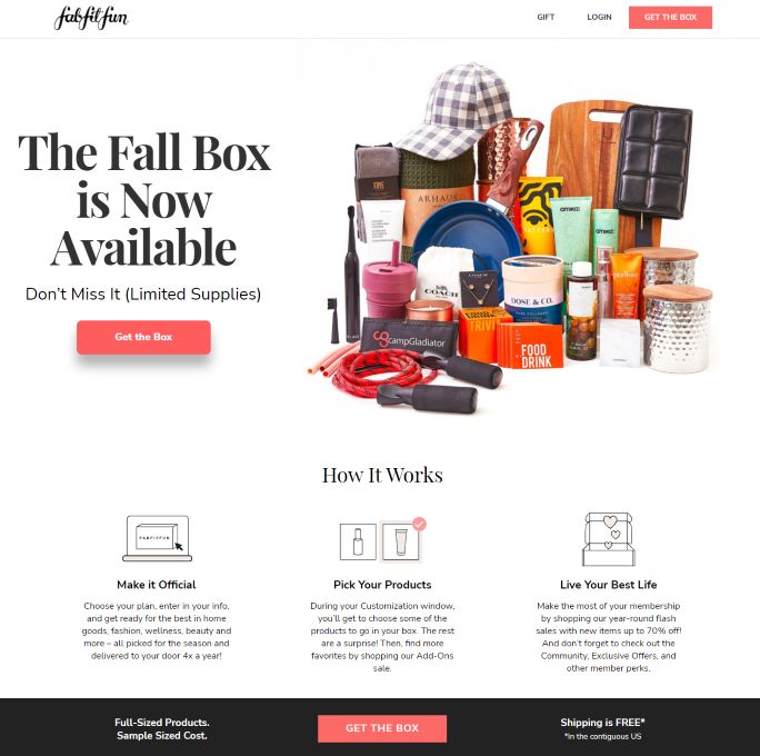
- The subscription service FabFitFun creates transparency by showcasing all the products that will be sent in a package
- They also include the product images and brand names separately
- The CTA ‘Get the box’ is supplemented with the message of ‘Limited supplies’, which creates an urgency for users to act upon
2. EdX

Why it works:
- The landing page headline catches the viewer’s attention through a discount for new learners
- The banner boasts the number of students already enrolled in EdX. This helps create trust with new subscribers
- The same CTA button features across the entire page so that the users aren’t confused about what action to take
3. Breadnbeyond
Why it works:
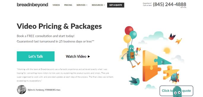
- Breadnbeyond stands out by adding a toll-free contact for better customer service
- The design elements on the page are kept at a minimum to keep viewers focused on the CTA
- As a media company, they offer a video introduction, and statistics show that adding videos on landing pages leads to an increase in conversion by 86%
4. I Done This
Why it works:
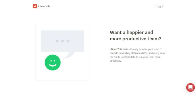
- I Done This is a tool that provides productivity reports for teams. The landing page uses simple graphics to showcase the tool’s features
- They also keep it simple with one sign-up form with the red CTA button that complements their brand logo
- The logos of some famed brands like Shopify, Twitter and Mozilla are featured to portray the tool’s effectiveness
5. Patreon
Why it works:
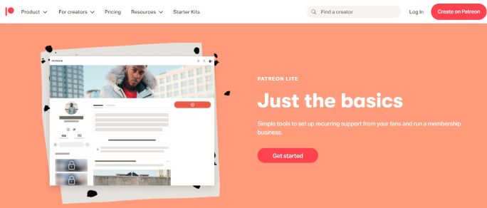
- Patreon’s landing page includes CTA buttons multiple times so that they don’t get lost in the detailed content
- The page showcases the number of creators and gives you a search bar to look for creators on the platform
- Backing up their benefits with creator reviews is an exceptional way to invite users to join the platform
6. Slowly
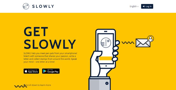
Why it works:
- Slowly is a unique service, and the landing page makes sure that you understand what the brand is all about
- The black CTA buttons to download the application stand out on the yellow banner
- The images showcase the application’s interface and tools to educate the users
7. Duolingo
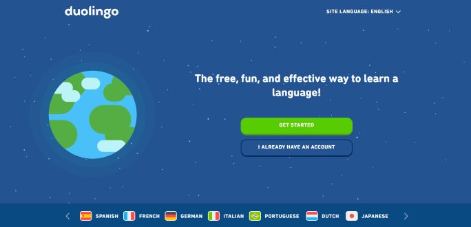
Why it works:
- Duolingo promises a free and fun way to learn languages and invites users to sign in or register
- Instead of detailing user reviews, Duolingo links the statistics to show their top ratings and prove their reliability
- The landing page gives an overview of their offerings like ‘Duolingo Plus’ and ‘Duolingo for Schools’ so viewers can opt for what they like
8. Simply Chocolate
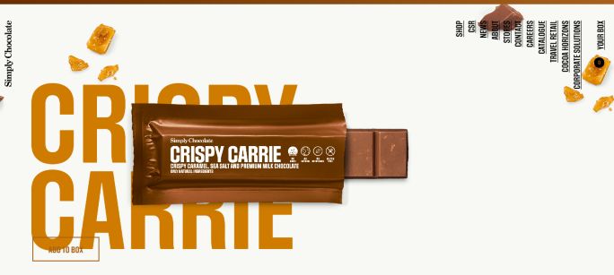
Why it works:
- A landing page that makes the best use of graphics, Simply Chocolate captures your attention with interactive images right away
- The page also provides navigation links, including their CSR, which highlights how the brand supports the environment
- Simply Chocolate provides ease in shopping by incorporating the cart/shop button on all its pages
9. Skullcandy
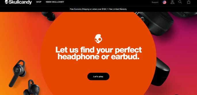
Why it works:
- Landing pages must compliment homepages with similar graphics and color
- Skullcandy’s landing page creates uniformity with its landing pages by using similar backgrounds
- The black CTA button is well-placed on the colorful background
- The page also highlights free shipping and limited warranty on their products as added incentives for the users
10. Mapbox
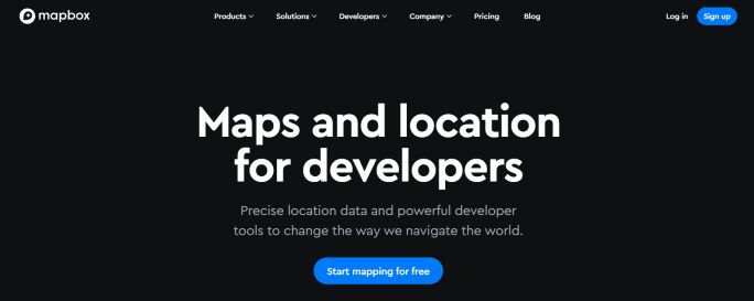
Why it works:
- Mapbox keeps it sleek and simple by showcasing its features through a carousel
- Customer reviews do a great job of creating confidence when inviting new leads.
- The CTA ‘Start Mapping for free’ doesn’t seem bland or generic and stands out on the monochrome background
11. Shopify
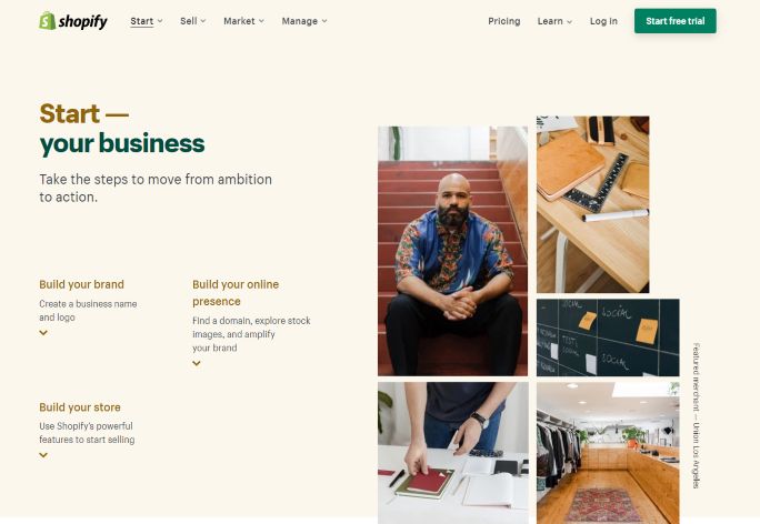
Why it works:
- Shopify has a brilliant landing page that offers multiple free trial CTA buttons
- They highlight their success with brand examples from different markets
- The page also gives an overview of the benefits of creating an online store with Shopify
12. Lyft
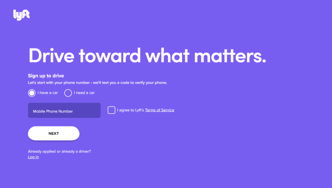
Why it works:
- Lyft makes great use of a compelling copy and images showcasing the application usage
- They include a simple signup form right at the start of the page with a colorful banner
- Lyft communicates its mission and benefits to educate the new users
13. Sundae
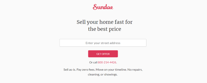
Why it works:
- Sundae incorporates quirky graphics to complement their brand name
- The page includes CTAs in the form of a contact number and offer buttons that stand out on the pale background
- Sundae shows its reliability by mentioning its ratings with logos from top publications or networks
- Not only does the page highlight Sundae’s benefits, but they also mention the situations when their services can be of help
14. Basecamp
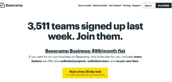
Why it works:
- The vibrant yellow free-trial CTA definitely catches your eye on the pale white layout
- The design includes a bold and affirming headline along with a subheading consisting of the benefits
- The copy also gives a comparison to supplement the tool’s benefits, so the users know exactly what they get out of Basecamp
15. Monday
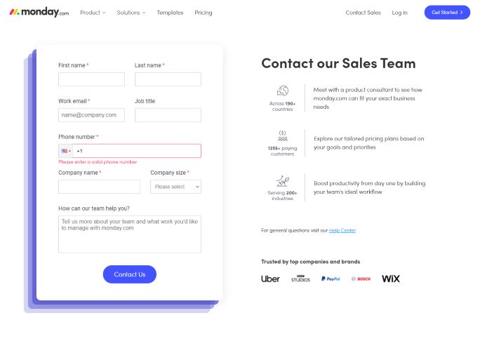
Why it works:
- Monday keeps it simple with two noticeable blue CTA buttons on a white background
- The contact form is accompanied by the benefits that users will receive through the service
- The page also emphasizes the number of companies that use Monday, along with some famed brand logos as social proof
16. Masterclass Business

Why it works:
- The page highlights the brand’s USP – celebrity instructors like Anna Wintour, Robin Robberts, Chris Voss, and more
- The colorful ‘Contact Sales’ CTA button is featured multiple times across the page to remind new users to sign up for the classes
- They’ve also added an FAQ section to give more information about their offerings
17. Blue Apron
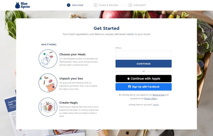
Why it works:
- Blue Apron’s landing page is perfectly segmented to incorporate their key content along with a simple sign-up form
- The landing page also gives an overview of how the meal service can be used
- A separate block highlights their USP, chef-designed quality meals with recyclable packaging
18. Zumba
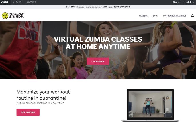
Why it works:
- Just like its homepage, Zumba adds a touch of color to the landing page to maintain the brand’s aesthetics
- The landing page offers a discount for new trainers and includes a short FAQ for additional information
- You’ll also find the benefits and features of the virtual classes in clean sections that are easy to read
19. Mooala
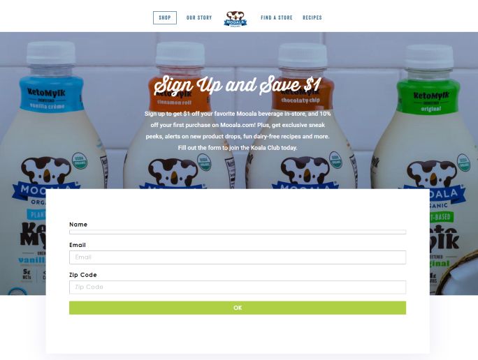
Why it works:
- Mooala’s landing page entices new users with a discount in exchange for an email sign-up
- The page also offers a sneak-peak of their Instagram profile along with its link. This is a great way to lead users to your social profiles
- Instead of using a bland background, Mooala keeps it interesting by using a product image as their background
20. Goby
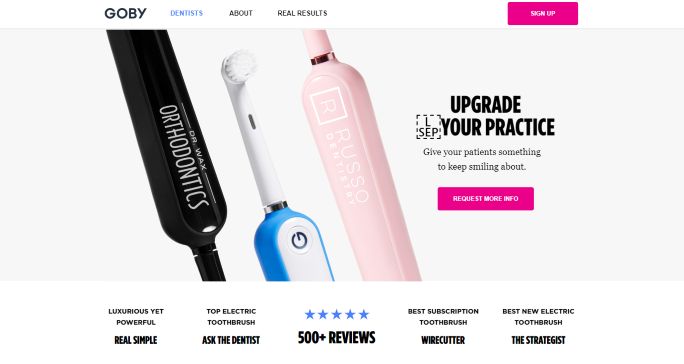
Why it works:
- One of the best product landing page examples, Goby starts out by highlighting its top reviews that are enough to entice new customers
- The page not only integrates high-quality product images but also includes statistics to back up their offerings
- They also offer easy email sign-up or chat and call alternatives for new leads
21. Feedly
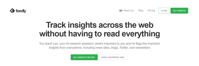
Why it works:
- The headline and subheadline give an overview of what you can achieve with this tool
- Feedly highlights its user count and 3-step process on the monochromatic page to make it stand out from the rest of the content
- Multiple CTA buttons are added for users to get started
22. Glo
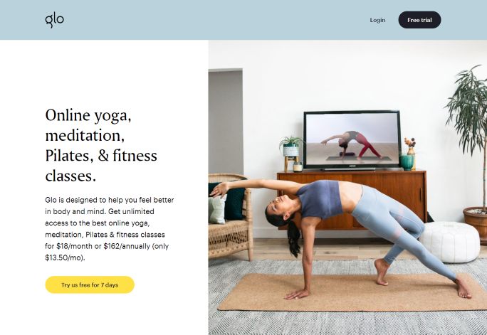
Why it works:
- The minimalist page details the price and features of the subscription service with a user image
- Glo’s landing page makes its benefits stand out with a vibrant blue background
- Offering a free trial encourages a new lead to sign up for their service
23. Mailchimp
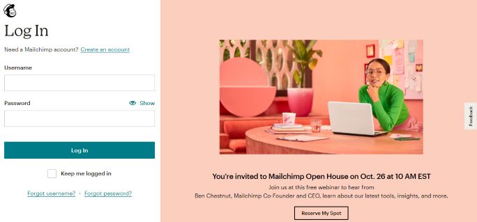
Why it works:
- One of the Mailchimp landing page examples is its login page that invites users to sign up for its free webinar
- The event details are highlighted, along with a CTA tab on a vibrant background that’s hard to miss
- The page also includes a simple feedback form to rate all their services. This is an excellent way of collecting user reviews without sending out separate emails
5 Tips to Create Better Landing Pages
If the above brand examples aren’t enough, here are a few tips for creating landing pages that will surely lead to conversions.
- Incorporate media in your landing page: Add interactive images, gifs, icons and videos to enhance your landing page. Good design can help your landing page stand out from the rest. Stick with pleasing colors and a uniform layout.
- Add customer reviews to your page: Numbers show that almost 92% of buyers are encouraged to make a purchase because of trusted online reviews. Incorporate customer images (with their permission), brand logos and testimonials on your landing pages to supplement your CTAs.
- Match your headlines with the CTAs: Don’t confuse your leads with CTAs that don’t go along with your headlines or copy. Customize your CTAs to maintain consistency. Similarly, don’t add 3-4 different CTAs on one landing page.
- Offer free trials or promo codes: New users are more likely to sign up for a service if they receive an incentive. Free trials will give users an option to test your service, while discounts will entice new leads to make the first purchase.
- Optimize your landing page for Mobile and SEO: With more people using the web through their mobile devices, it is important that your page design can be viewed on mobile with ease. Also, make use of relevant keywords in the landing page’s headline, URL and copy for better search engine results.
Wrapping Up
Brands can design landing pages for targeted audiences through various online tools. You can provide a quality experience to your leads, drive conversions easily and track them.
The best part about landing pages is that you can utilize A/B testing to find which elements are performing well. Make sure that the landing pages are uncluttered, integrate stunning visuals and clear CTAs, and you’re good to go!
Looking for a better boost to your blog pages? Use SocialPilot’s RSS Feed Automation Tool to automate seamlessly sharing your blogs to your social profiles. This tool also has an auto-hashtag feature and shortens URLs automatically.


